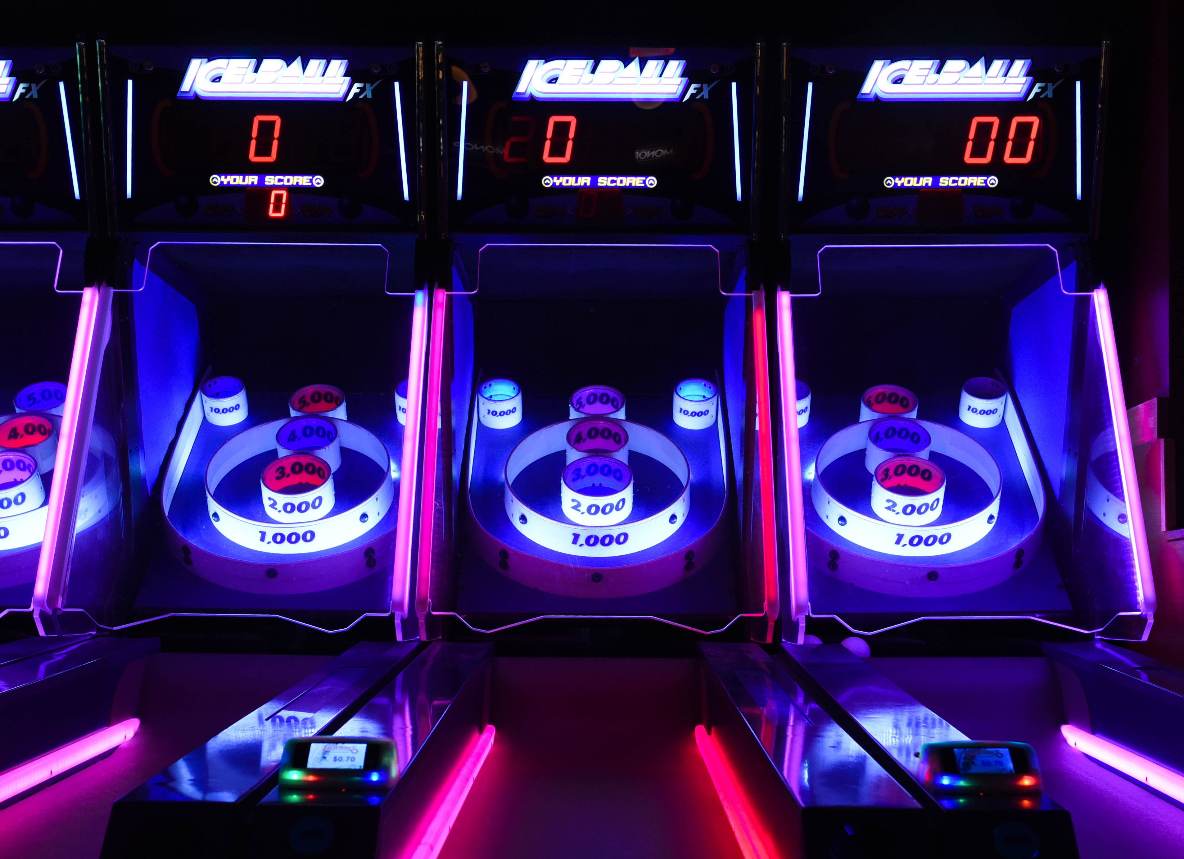

This case study project displays a high score tracking app that would allow users to keep track of their personal high scores from arcade games and compete with other users to see who can get the highest scores. This app can also act as a way for esports investors to recruit new talent and even act as a form of advertisement for local arcades.
I was responsible for everything UX related to this project - from user research to wireframing to prototyping and more.
Analyses of similar apps were conducted when researching for this project.
There was one particular assumption that was considered. The idea of the already existing company brand must be consistent with this product, as it seemed important to arcade owners.
Based on user research, we found several important features and app aspects that must be considered. Interfacing the app with the various machines was just one of these.
My goal in this study was to determine if users can complete core tasks within the prototype and determine if the app is easy to use. With this in mind, I chose to focus on the following KPIs:
- Time on taskIn creating a UX Research Plan, I decided on the following prompts:
Prompt 1: Register in the app as a user and connect accountsAfter conducting a usability study, I found the following:
1) The app should have an increased amount of sectionsI also wanted to improve on accessibility. So, I adjusted typography and improved color contrast for legibility. I also added navigation elements and icons to the bottom of the screen for easier navigation. Then, I color coded fonts to increase cohesion within elements of a section.
I learned that navigation and flow are essential to using applications, regardless of the app’s intent for its users.
If I were to continue from here, I believe that my designs could be expanded upon to increase the amount of features it provides to users. This shall make it easier for users to better connect with one another.
I also believe that more testing for increased feedback might be expanded upon to increase accessibility and usability.